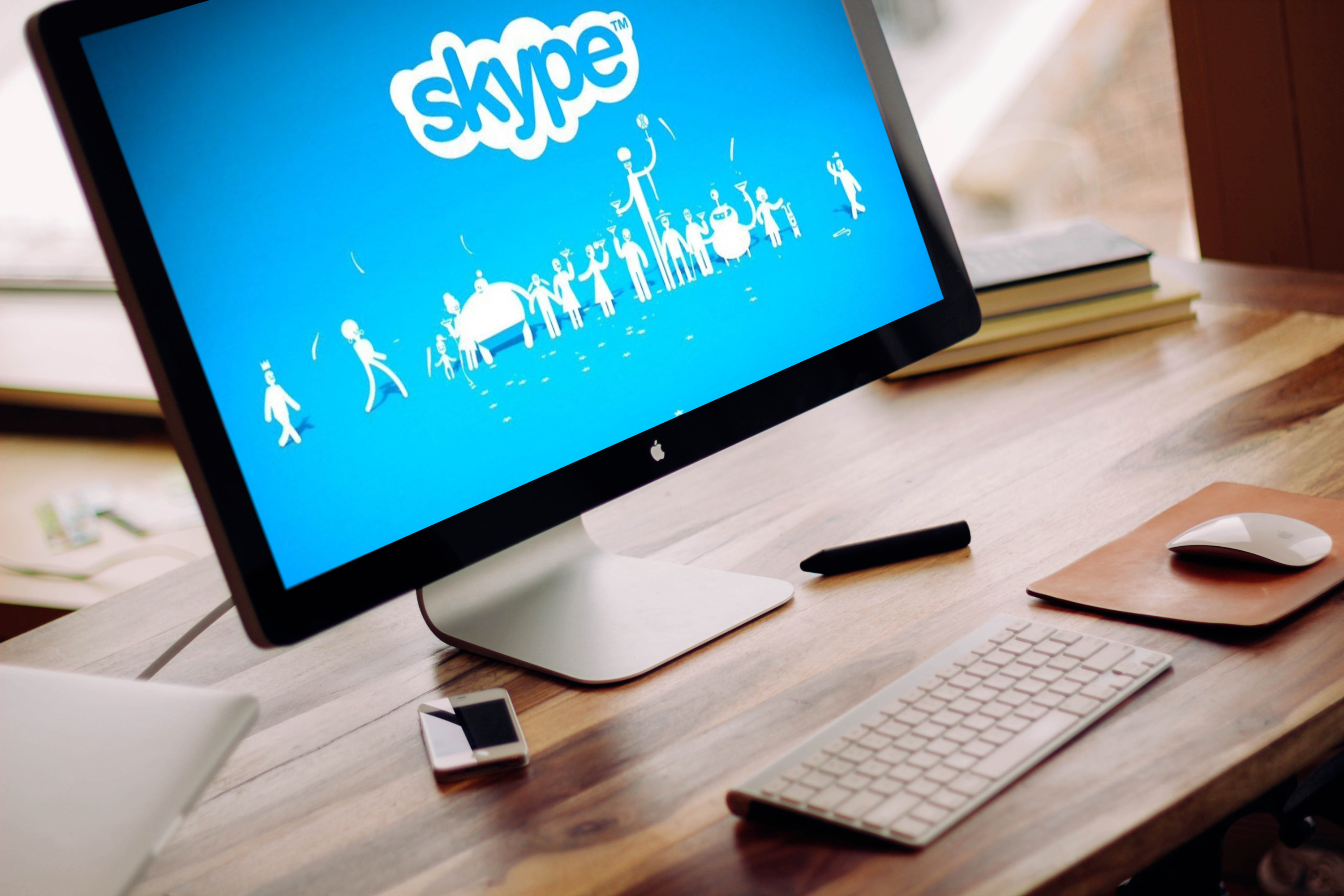
Skype Redesign
Name: Skype Redesign
Role: UX/UI Designer (large emphasis on research)
People involved: Fanny Guan, Julia Hoang, Shereen Jayme, Victoria Lai, Kenzo Makitani
Tools Used: Photoshop
Overview
This case study outlines a school project where I teamed up with four other students to redesign the application Skype. Within the span of ten weeks we identified usability issues with the Skype interface. This project has a large emphasis on UX Research. We recruited users ranging from ages 15-25 to help us understand the target audience of the application. With the help of these users, we utilized UX research methods in order to uncover problems with Skype and redesign the UI. There was no coding involved in this project.
The Approach
To make this case study easy to follow, each part is split into their own section and listed below.
- Understanding the Product: Application Research, Competitive Analysis
- Understanding Users: Interviews, Survey, Affinity Diagram
- Identifying Usability Issues: Usability tests, Cognitive Walkthrough
- The Redesign: Sketches, Wireframes, High Fidelity Prototypes
- Testing Redesign: Heuristic Evaluation
- Final Thoughts: Lessons Learned
Understanding the Product
Application Research
Before we began the redesign, we needed to understand what Skype was and understand the reasons why it was created. Everyone in our group has used Skype in the past and we were familiar with the various functions but we never delved deep into the history of it. In order to successfully redesign the application, we needed to understand a few questions.
Through research, we were able to answer these questions.
- What exactly is Skype?
- Who Skype was geared towards at creation?
- Why was it created/what problems did it try to address?
Competitive Analysis
In addition to understanding the product itself, we needed to understand its competitors. We identified the strengths and weaknesses of four other applications that are relatively close to the functionality of Skype. We looked at two direct competitors - Facebook Messenger and Google Hangouts, and two indirect competitors - Discord and Raidcall.

Direct Competitor Comparison
With our research we found that Skype and its direct competitors, Facebook Messenger and Google Hangouts, share all the major features with the exception of Facebook Messenger not having a Web Application anymore.
Indirect Competitor Comparison
Discord and Raidcall were the two indirect competitors we compared to Skype. We found that the user base differed with these applications because Discord and Raidcall are geared more towards gamers and gaming communities rather than working professionals.
Understanding Users
Interviews
To understand our target audience more we interviewed people that fit our target population. Each member of our group interviewed two people within the 15-25 age range. We focused our interview questions on the user’s lifestyle, their Internet use, and their application use when on the Internet. If the participant has used Skype before we asked further questions about their past experiences with it.
From our interviews we found common themes between the ten participants:
- Skype was widely used because it was the only program that allowed voice and video chat for free
- Participants preferred video chat over voice chat because it closely resembles face to face contact
- Connectivity was a major issue when using Skype
- Skype was rarely the preferred way to communicate over the Internet as it seems outdated and “looks like a child’s toy”
Survey
To obtain quick, general data from a large amount of people we created a survey that focused on Skype. We focused on asking questions about what features participants primarily use, what features they have tried in the past, and whether or not they use other applications instead of Skype. Each member of the group sent the survey out on social media and had a total of 118 participants.
From the survey we found that:
- Most participants used Skype primarily for video chatting friends and family
- Skype is outdated
- 59.3% of participants prefer Facebook Messenger over Skype
Affinity Diagram
To collectively analyze our interview data we created an affinity diagram. Each member wrote down every important detail from our interviews on sticky notes and together we created groups based on the types of answers we received. From there, we created bigger, generalized groups that uncovered different themes.


Identifying Usability Issues
Usability Tests
We conducted usability tests with participants using the think-aloud protocol. Each member of the group was in charge with one usability test and we assigned another member to take notes while the test was going on. As a group we devised a script for the test that included five tasks in total as well as a questionnaire at the end. The test and questionnaire took 30 to 45 minutes in total.
Cognitive Walkthrough
We conducted a cognitive walkthrough by defining what tasks Skype users perform while using the application and . We tested four important tasks:
- Logging into Skype
- Starting a screenshare in a video call
- Privating Skype profile
- Adding Contacts to Contact List
Major Issues Identified
Tying together all our research we were able to find out the major issues users typically have when using Skype.
Icons
A large portion of issues pointed towards the confusion of similar iconographic elements on the interface. Namely, the "+" symbol was confusing as the interface used it in varying contexts that each exhibited different funtionalities.
Interface Structure
Buttons users typically expected to be in one place were found elsewhere where they did not expect it to be. Lots of important functions such as screen sharing was not easily visible when in a call with someone.
Ambiguity
Ambiguity in the affordances of controls caused confusion for users. For example, the search bar does not make its scope of functionality clear to the user. Its function is to search through existing contacts only, not the entire Skype directory, which confused many users.
Alternate Flows
There is an excessive amount of alternate flows to important Skype actions. Inconsistencies between multiple controls with the same affordances make it harder to nagivate through. These can overwhelm a user instead of giving users easier access to each function.
No Feedback for Certain Actions
Skype does not give any feedback when people change their settings. Participants in our research were confused whether or not their settings saved. Because of the lack of feedback, many participants tried to close and access the page once again to double check whether or not it worked.
The Redesign
Using the findings from our user research, we redesigned the interface of Skype in order to enhance the user experience. We did our best to target each major issue uncovered as stated in the previous section. With these in mind, we had three targets to prioritize redesigning:
- Making additional call features more obvious
- Improving the process of adding contacts
- Centralizing profile privacy settings
Sketches
For each target we created quick sketches in order to map out our ideas on paper. For the sake of keeping things brief, the next sections will be focused on the third target, "centralizing profile privacy settings". Shown below are the sketches for this target.


Wireframes
We then took those sketches and created wireframes to outline the basic structure of our designs. Below is the last wireframe for the "centralizing profile privacy settings" target.

High Fidelity Mockups
Using our wireframes we created fully fleshed out designs.

Testing Redesign
Heuristic Evaluation
Using each of our redesigns, we conducted a heuristic evaluation in order to evaluate their improvements. Each person in our group evaluated all redesigns, ran through the tasks ourselves, and noted down the strengths and weaknesses of the redesign to use for the next iteration of designs.
Using the "centralize profile privacy settings" target as an example once again, below are our findings.
What worked:
- Displaying all checkboxes for profile details user options and selections clearly and is a familiar control to work with for users.
- Checkboxes work well as both a control and feedback indicator in itself.
- Checkboxes are a clear indicator of when the user has entered editing the privacy settings.
What can be improved:
- Design needs an easy cancel button for users to quickly exit out of editing settings.
- A "revert" button could also be included for users to quickly revert all changes made during their session.
- Checkboxes per profile detail sacrifices some aesthetic for functionality.
Final Thoughts
Lessons Learned
Doing this project helped me learn how to use UX research in order to redesign a fully fleshed out, successful, software. I learned that no matter how successful a software is, there will always be room to improve based on what users need and each iteration of a system is important for evolving. Further, I learned how to work in a group setting and follow a set schedule to keep a project on track.